The power of colour in visual content
Think of Piccadilly Circus or Time Square for a moment. What do you see? Bright, colourful adverts all competing for our attention.
From big OOH displays, in-store POS, brochures, packaging all the way to our TVs, and now on our phones at any time of day; we’re constantly surrounded by a world of colourful advertising content. We’ve become so accustomed to it that we’re almost blind to its effect. But what does colour truly add to the impact of a marketing advertising campaign?
In this article, our Lead Creative, Victoria Harley, explores how to use colour strategically to enhance visual content.
About this post
Published
Author
November 11, 2024
Photography has been a key tool for advertisers since the late 1800s, when accessible half-tone printing first emerged. By around 1910, advances in printing technology made colour advertising more commonplace. As products evolved to be aesthetically pleasing rather than just functional, colour in adverts proved highly effective. Daniel Starch noted in 1923 in his work The Principles of Advertising, the use of colour in advertising directly correlated with increased purchases.
Brand identity
and colour
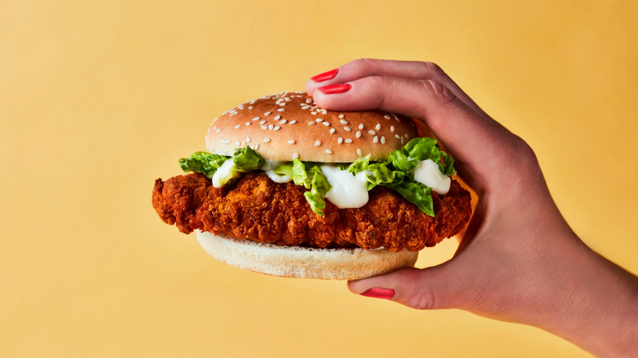
From McDonald’s iconic red and yellow to Barbie’s signature pink, some brands have created an unbreakable connection with specific colours.
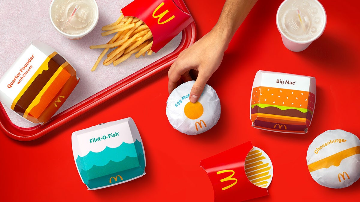
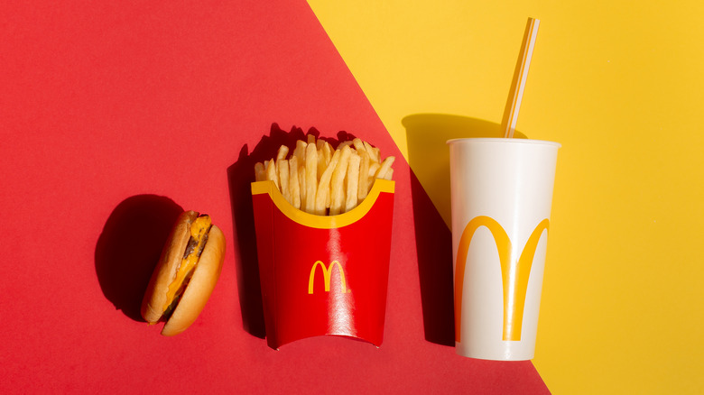
A brand’s colour palette can be a vital part of how we recognise and connect with it. In 1998 Tiffany’s trademarked two shades to protect the power and strength of their packaging as an indicator of quality and craftsmanship. This iconic palette grew from the brand’s heritage, inspired by Tiffany’s Blue Book, first published in 1845.

Sometimes an iconic colour scheme comes from the product itself. Guinness leaned into this for their recent campaign “Looks Like A Guinness” playing on the immediate association with a black and white shape and a pint. From a snow covered wheelie bin to a pair of dripping socks they all read as a perfect pint of Guinness.
This is not their first use of a monochromatic colour palette. The iconic 1999 Guinness Surfers TVC, used almost tactile black and white footage creates a point of stillness and reverence that still cuts through today. This consistency over time has helped cement the brand’s unique visual identity.
Colours and associations
Everyday, we interpret meaning through colour, from road signs using colour to convey information to the outdated gendering of certain shades.

But while we use colour purposefully in our work… we need to remember that, as UK-based creatives, we likely view colours through a Western cultural lens. This perspective influences the meanings we attribute to colours, which can differ widely across cultures. For example, in Western cultures, red often conveys danger, love, or passion, whereas in India, it symbolises purity, and in China, luck and happiness. Colours associated with mourning and death also vary; in the West, black is the colour of loss, while in Japan, it is white, and in the Middle East, orange.
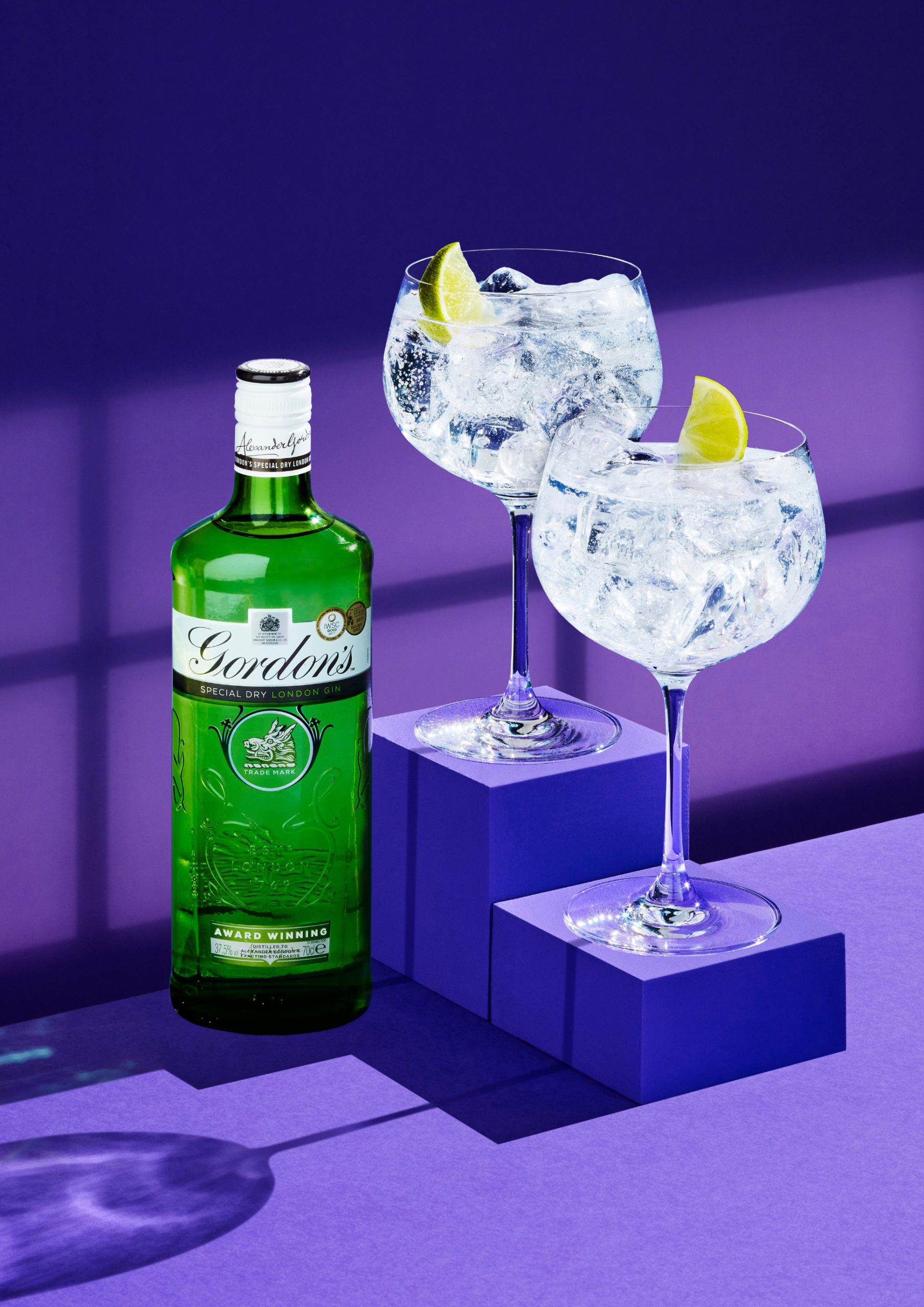
That said, we can strategically use connotations of different colours to our advantage when creating work. Green often implies freshness, naturalness, growth and health. Blue creates a feeling of calm, peace and trust. And purple suggests prestige, heritage and quality.
Tools and resources for colour selection
Starting to build a colour scheme for an image can feel like a daunting task. If you’re feeling completely lost, a colour wheel can be a helpful starting point, but don’t feel confined to it. Inspiration for a colour palette can come from all sorts of places: the world around us, classic design, art, film. Think of how the films of Wes Anderson or Barbie have influenced the marketing and advertising world, even giving rise to the Barbiecore trend last year!
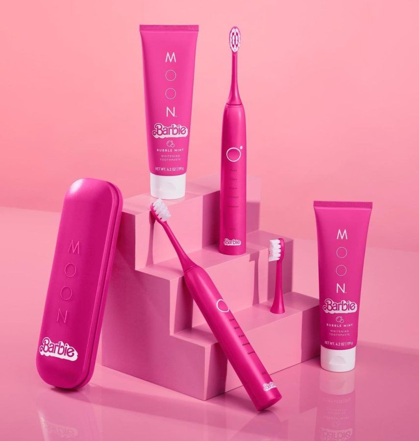
There are many different ways to approach building a colour scheme, depending on what you’re aiming to create. Your colour palette might need to incorporate brand colours or follow a strict set of guidelines, which can serve as a great foundation. Start by asking yourself what you need to achieve: Are you tapping into a current trend, or are you creating something timeless that can evolve over time? Does your target audience provide any direction? Think of demographics, psychographics and preferences. What is the emotional response you want to evoke? How flexible does your palette need to be? How many mediums are you catering for?
For example, you could embrace the predicted maximalist trend by using bold, super-saturated colours to create a vibrant, attention-grabbing palette, perfect for content or campaigns that want to stand out and make a statement. On the other hand, if you’re aiming for a bold yet more refined and elegant look, consider working with variations of a single hero colour drawn from your subject. This more minimalist approach allows the chosen colour to shine and adds depth and sophistication without overwhelming the viewer!
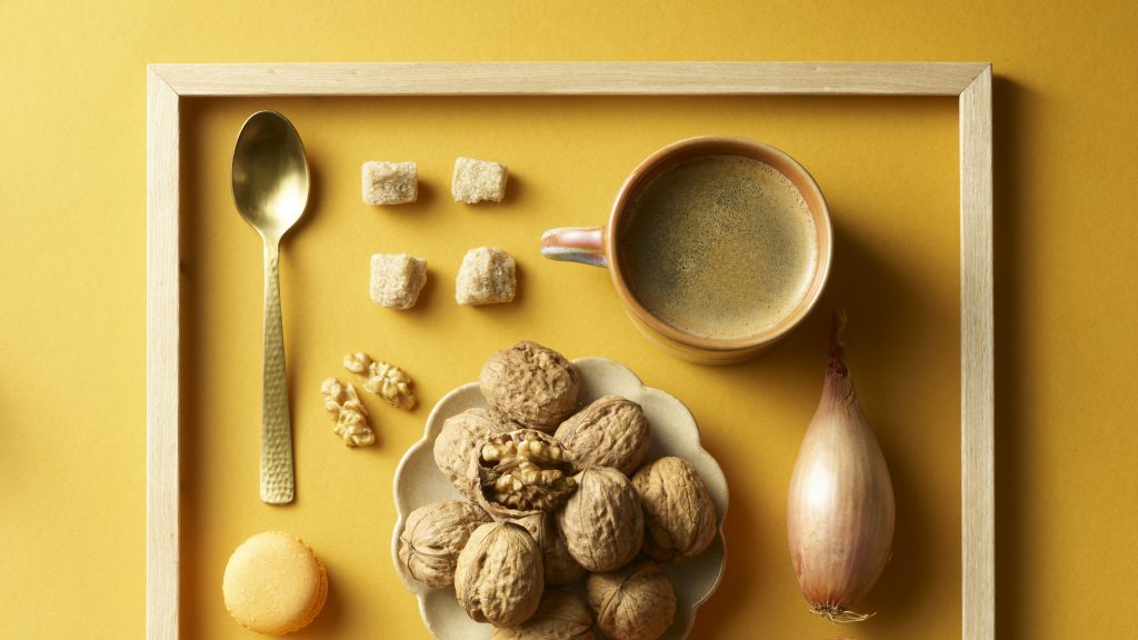
I could go on for hours. But going back to my point, there are tons of tools out there to facilitate the process. For trend-based inspiration Pantone Colour of the Year and WGSN Trend Reports curate a new palette each year which are influenced by tech, innovation, design and wider social topics. Pinterest is also a fantastic tool. I personally have a folder of shots with nice colours and combinations, covering anything from interiors to street scenes and landscapes.
Finally, when you’re looking for a colour scheme, don’t just focus on the subject matter; think about the overall balance of colours in the image(s). Tools like Procreate can help you generate a custom swatch set from any image you import, or you can use the camera to capture a palette directly from your surroundings. Procreate Pocket is a fantastic way of capturing colours on the go, providing inspo no matter where you are.
I’ll wrap up with some advice for you: keep looking, stay curious and and collect references, even if you don’t have a specific project in mind. The more you look and train your eye the more confident you will become.
You just never know when (or where) you will spot that dream colour inspo!
If this article has inspired you and you’d like to explore how we can elevate your visual content, feel free to reach out to us at [email protected].
