Complete overhaul of Applaws packaging
Applaws is a premium pet food brand under MPM Products, known for its commitment to natural, high-quality ingredients. With real meat or fish and no artificial additives, Applaws aims to keep pets happy and healthy with food that’s both tasty and honest.
About this post
Published
Services
August 21, 2024
Production
The brief
MPM was in the lookout for a production partner to help them capture a packaging overhaul for their brand, Applaws, which was inconsistent and desperately needed a refresh.
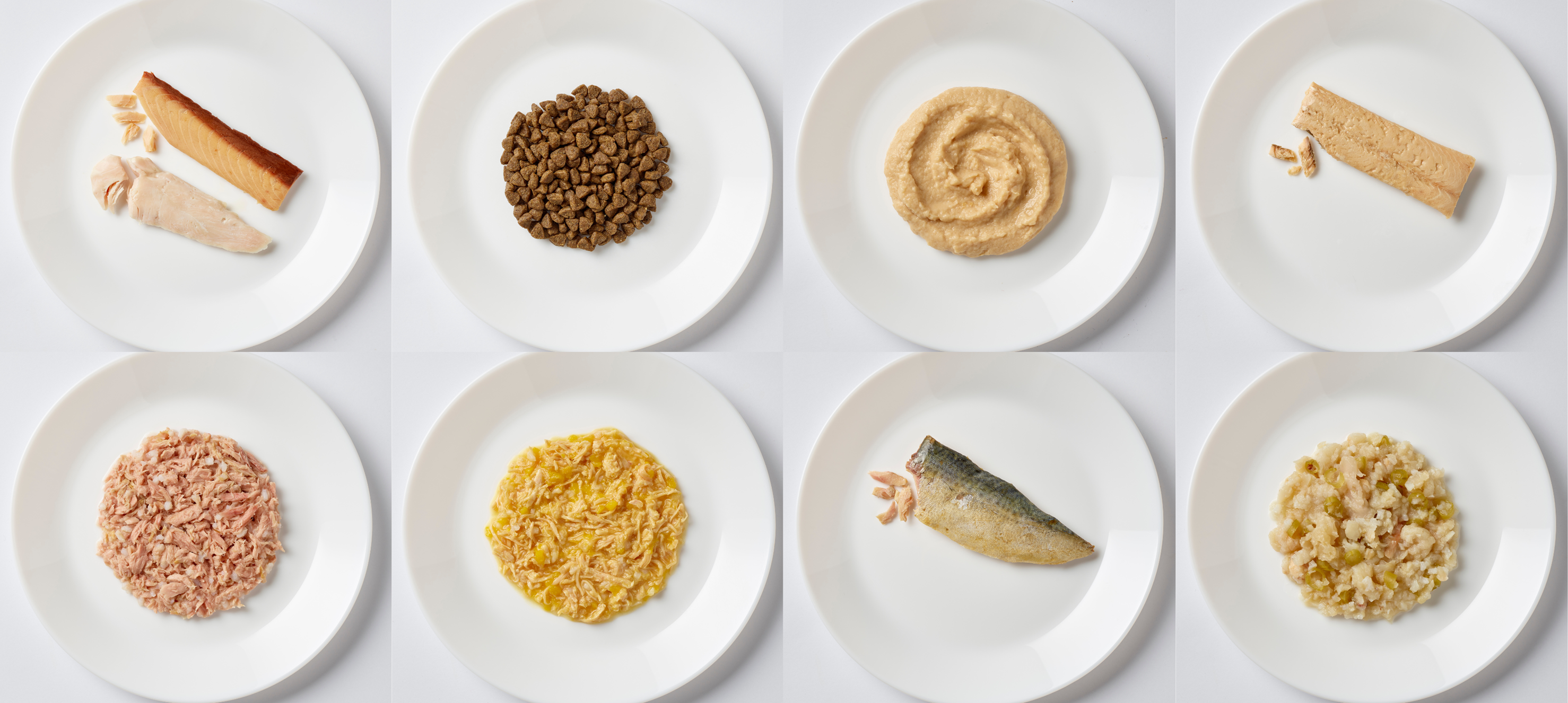
We needed to capture 96 products that emphasised the taste appeal (to humans) and the high quality of the ingredients.

The challenges
We faced several significant challenges in this project, primarily due to the very tight timeframe from the moment we received the brief.
Tight timeframe
The shoot had to be completed within a strict deadline to align with the print schedules. This left little room for delays, making it essential to streamline our processes and maximise efficiency on set.
Product-specific stipulations
Each product had unique requirements that had to be followed to simplify the artwork process for the in-house team. This was crucial for maintaining consistency and ensuring the final images could be seamlessly integrated into the packaging designs.
Precision in image editing
For certain products, particularly those containing liquids, precise image editing was needed. For example:
Tightly pathed products: Some products required tight pathing to ensure no liquid was visible in the final image. This was important to maintain the product’s visual integrity and meet the brand’s aesthetic standards.
Liquid-heavy products: Products like broths, which are entirely liquid, presented a completely new challenge. The edges of the product where the plate was visible through the liquid needed special attention. Transparency had to be carefully added in post-production, allowing the artworkers to recolour the underlying plate without altering the natural coloration of the product itself.

Our approach
Given the project was a brand refresh, we needed to ensure that the client felt comfortable with the direction we were headed in so we opted for a “style-setter” day to ensure that we had approval on shot direction for all SKU’s on the first day.
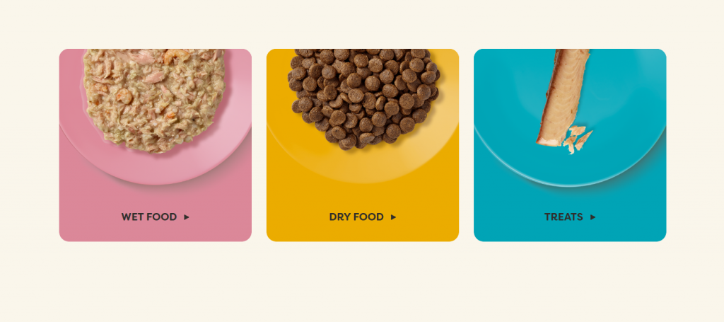
For days two and three, we structured the shooting schedule to ensure we were working on all products within a category, before moving onto the next category. This meant that our dual food stylists could get into a flow-state when it came to styling each category, improving their speed on set.
Having the client team on-set throughout the course of the three day shoot meant that not only were they involved, able to provide opinion and sign-off, but were able to bond with our photographer, enabling him to become a future brand guardian for them.
For the majority of the shots, our photography was conducting what we call “scratch & dust” retouch on set.
Despite being on a particularly tight deadline with the imagery in a really busy time of year, we were able to deliver on time as our shooting photographer could brief in another of our in-house photographers to undertake complex edits, whilst they were finishing batch editing.
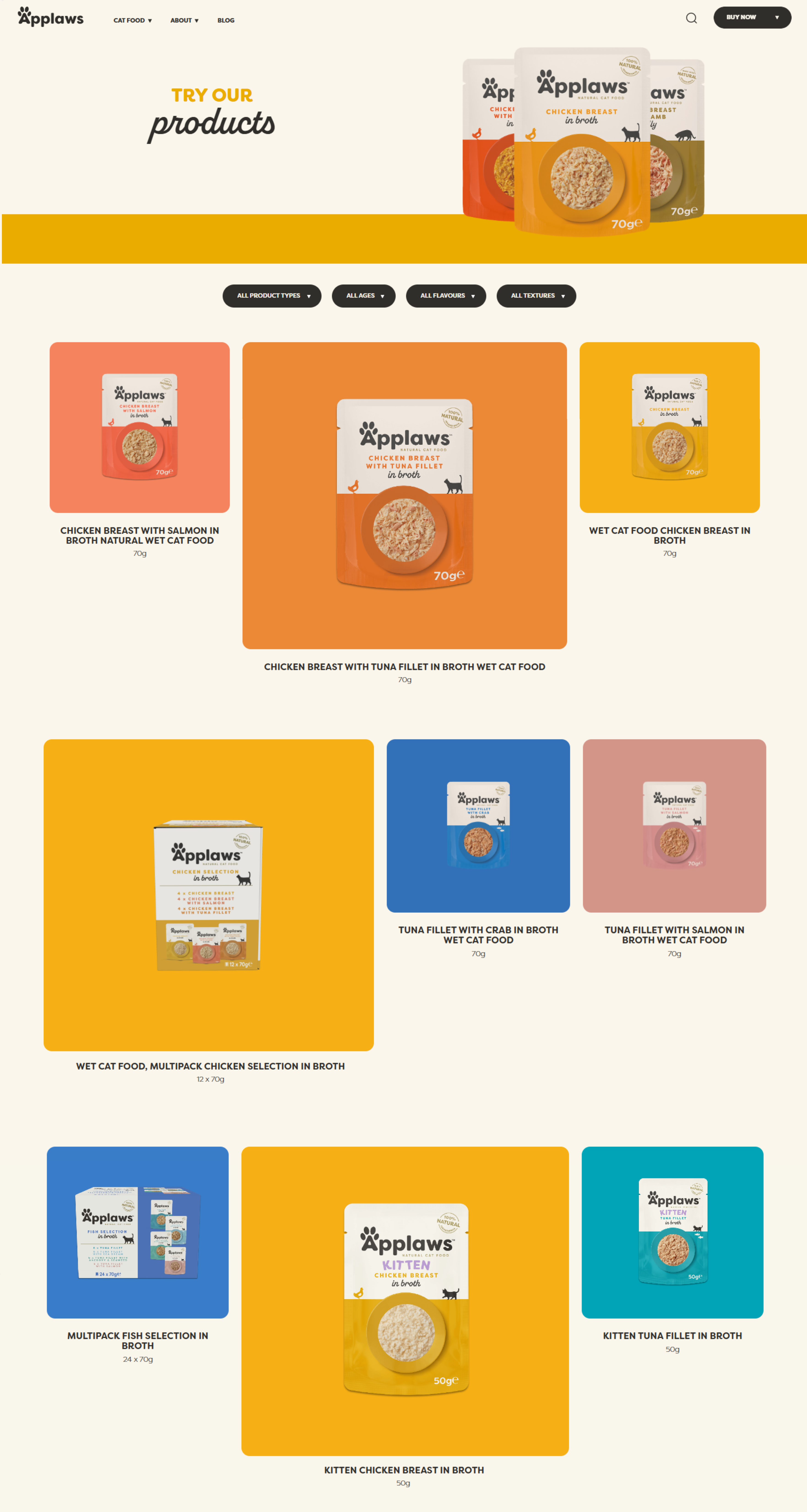
Take a peek at their products below.

Results
We delivered 181 assets in just two shooting days, significantly cutting photographer costs and maximising the space and resources. This approach saved the client 20% in costs and 33% in time compared to their usual methods.
181
assets
20%
cost saved
33%
time saved
Who worked on this one
This project wouldn't have been possible without our awesome team!